Stylish Waterfalls: The Journey [1/2]

In our last art update I outlined the creative steps that went into the production of the Bindstone map.  I finished off with the next steps, and in that list as a final bullet point I boldly and confidently stated, “animating the waterfalls will likely be the last step in this process and should finalize the map!”

Well, the map isn’t final. The waterfalls are though! Let’s talk about it.

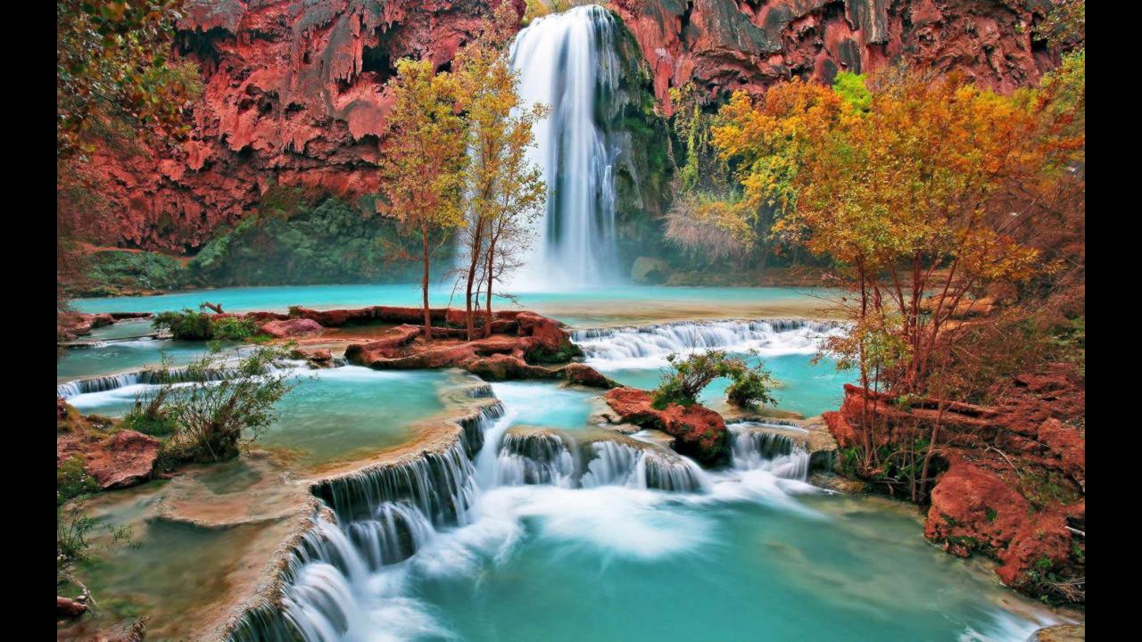
First let’s break down what’s in our waterfall. Rocks, moss, water (river/stream/pool/whirlpool), and lily pads are a pretty good summary of the basic parts. You can see a screenshot of the final look for this stuff below. (Note: the buildings, tile, light trees, and stone outside the waterfall path are all works in progress and not complete.)

My 3D pipeline was already complete and the general look for the waterfall stones had already been defined structurally based on reference. I’ve described this in detail in the previous article, but essentially there are two primary styles of stones in the waterfall area. There are organic rounded shelves of the waterfall, and more blocky and chiseled stones. I’m going to pick up where the previous article left off and discuss the process of working off those 3D renders and taking the asset to completion in Photoshop.

By the time I got to the waterfall area, I had already gone through and smoothed the rest of the map. The process for smoothing was largely a mechanical one where I paint over the original rough 3D render and preserve the lighting information. This is to provide a uniform paint layer to work from, but I have not introduced many details or textures at this point. I was saving the waterfall and rock section for last, but by the time I got to it I decided it would be good to just paint the final details of that section all in one pass.

So let’s rock out and look at what goes into a stone!

The rocks are the very first area of the map that I was beginning the final detailing of. There was something kind of high pressure about moving forward on this task knowing I was aiming for a final asset. There would be no further buffer of process between the result of this and what would be seen in the game. This was essentially the beginning of the end!

I actually stressed myself out because I really wanted it to look great, but didn’t know exactly how to get there. I rallied and I spent a while researching and studying rocks in other games. My favorite and most influential resource, however, was a tutorial by SephirothArt available on youtube and in an extended format for sale on his gumroad.

Seph’s tutorials were immensely helpful in getting me started. I decided to try painting 5 stones completely separate from the 3D renders to get a good feel for the overall process. I ended up with 6.

I feel like I did a good job with these practice stones. Naturally, there were days where I was unhappy with the results of my practice, some came out better than others. I also took tentative steps to try to apply these results to the 3D render but was really unhappy with the early attempts and kept coming back to my practice. You can see these practice stones in order of completion below.

You can see a lot of golds and reds painted on the stones to make them stand out from the grass. I mixed opposing colors and added the reflected green tones to finish the look. I was inspired by Seph’s tutorial, but used my own colors. You can see some variations on the texture with some rougher areas and different types of shading. I was experimenting to see what worked.

While this let me play without constraint and get a feel for how to achieve a painterly stone texture, there was still some learning to do. The tutorial stones all had a strong light-source which made shadows and contrast pop out a lot. They also had no constraint over the original shape of the rocks as they were all invented fully in 2D. I still had to figure out how to apply this as a paint-over technique in the context of my existing map with existing rock formations.

On the actual map the lighting is much more subtle and the rock shapes are larger. Color selection had to be more subtle and was difficult to pull off without losing the style. Some of my practice applying this style to the existing render is below, but honestly my first attempts were complete disappointments.

I’m not happy with either of the examples of paint-over attempts below. They looked too much like the 3D render and the 2D tutorial method didn’t really translate as well as I had hoped. I kept re-visiting my independent practice stones from the tutorial and kept painting more until I decided I had spent enough time practicing and needed to move on. My confidence was not very high, but I felt a time pressure and was worried about losing steam on the task.

This practice period lasted a couple weeks and I decided it was time to move forward. I was feeling hesitant, but also did not want to use excessive practice as a procrastination tool. I felt like I had enough experience to do a good job so I just buckled down and started.

I began in the middle near the lower area that had really strong light on it to ease into the task. I was able to finish about one cluster each day. You can see a representation of 4 clusters below representing 4 days of work.

To achieve the final look I start by smoothing the stone texture in the 3D render. This is an extra step not present in the original tutorials because the tutorial stones were built from scratch. My base layer was a lot messier and more detailed and simplifying the colors was a necessary first step. This is done by sampling color from the 3D render and painting over that render with a smooth brush. Sample, paint, repeat.

After the initial smoothing step I increase the saturation by 60% in Photoshop. It expands the color palette and gives a more dynamic color range.

The brushes I used were the same ones used in Seph’s tutorials (available as part of the isometric stones tutorial pack). I would smooth the faces with a round brush, then switch to chalk type brush to add a rougher texture. I carved out grooves in the stone to break up the faces and edges to obscure the original 3D geometry a bit and make the stones appear more natural in shape.

The final detailing was the scratches, marks, and highlights to the stones which dramatically made them look more authentic and weather worn.

Finally, I adjusted brightness and contrast and increased both by 12. It gives the stones a small visual kick that helps a lot. This is what the stones look like before and after I finish with each section. I am trying to get the 3D render to look as much like a 2D painting as possible, that’s the whole point of painting over the render in the first place.

It took constant focus to get the simplified natural look I was trying to achieve. Some days I was better at this than others. If my mind was wandering I could easily slip into making the same repetitive brush patterns that went against the shape of the stone. My hand would tend to create circular hook shaped patterns if I lost focus. I paid a lot of attention to the curves, faces, edges, and lighting. Working from light to dark, bottom to top helped keep the whole piece consistent.

The closeups above show details and brush strokes coming out well with various lighting conditions.

The reason I took this part of the map to completion first is because it is at the edge of the map and is not where the player will be usually looking. By working on this less critical area before finalizing the rest of the painting I could gain valuable practice painting in the final style with less pressure on the results. I’m proud of how it came out.

With the rocks finished I decided to just dive right into painting the pools.

It actually went really smoothly and took very little practice to get right, I feel like the effort I put into painting the rocks translated really well and it felt good to breeze through this task!

I started by smoothing out the blue as it was already there from the 3D render (we had a partially transparent blue waterline placed in each pool.) I used the same chalk brush on the stone walls and floor and brought in darker blues depending on the depth of the pool. I made all the edges softer to give the appearance of being submerged. I added small clusters of stones resting under water and carved out larger cracks on the bottom of the pool. I am actually really happy with how they turned out. I think they look great!

At this point all the stones and pools took roughly 3 weeks of work not counting my practice time. With all the pools complete I had one remaining pool larger than the rest. The bottom of the waterfall where the streams all join to become a river flowing directly into the well. This was the last water-submerged area that I needed to paint over.

I knocked it out on a single Sunday evening. I smoothed the whole area and painted the larger stones, then I slowly added little stones that were clustered together and made the river bed. I was so happy it just took a single really productive evening to complete since I was planning on spending few days on that area! Below are some before/after pictures of the final river pool texture.

You can see the panels of the inside of the river actually are extensions of the tile from the 3D model which just happens to intersect with the river. Because I designed the tile in 2D and Michael did the 3D sculpting of them I didn’t realize this visual artifact was unintentional but I really liked the look of it. So I kept the panels and painted them as intentional walls inside of the river using a similar technique to the stones.

Because the 3D render of those walls was unintentional some of the tiles were different heights and dropped down awkward distances. There was also an early decision to have a large broken piece of the well in the stream, but in an effort to visually simplify the area I decided to eliminate it. These changes required some freehand painting to erase them.

You can see the progress below:

Everything came together really clean. At this point I have the stones and pools complete!

It’s time to go with the flow and draw some waterfall streams.

The technical work involved in stream animations will be described in part 2 by Michael. He was working on the technology required to bring this to life alongside my own work. At this point he had a working concept and idea of how to integrate my streams in the game engine. What he needed at this point was a painted guideline of the streams he could use as a tracing guide in our engine and animate.

With this in mind I spent a couple days figuring out how and where precisely I wanted those waterfall streams to flow. I paid special attention to the shapes of the rocks and how water would flow over them naturally. You can see it took an intermediate step where I had highlights to help visualize the final look before revising and flattening the water to provide a simple outline for animation in the game engine.

With those waterfalls painted and bundled up for Michael to integrate in the game it was time to start the next task. Moss. I have said it before, but…

I seriously hate moss. There’s no pun here. Moss just sucks ass.

Part of the reason I hate moss, is that it is hard to paint simply without making the texture distressingly busy. It is also the final layer of color on the waterfall which means there’s no hiding any mistakes here. It needs to look good. I have studied how other artists do moss and it is usually just the silhouette of it with hints of detail. There’s a beauty to abstract detail, but it is hard to get right. I felt very hesitant to cover up all the beautiful stonework I had painted with something that didn’t stand up to the same bar of quality.

I had a hard time finding a brush to do it in. Then because I wasn’t fully invested in covering up the stones I kept making the patches of moss too small even though Michael had suggested it should grow larger and cover more and I agreed with him. It was hard to bring myself to do it. I was starting to feel a bit of a mounting time pressure to solve this visual issue as well. This is entirely internal, of course, but I was already pretty happy with how the waterfalls were coming out and I didn’t want to over-invest time in the outside edges of the map.

So, as I often do when in doubt, I spent some time studying reference material. I looked at a bunch of art and nature photos of waterfalls and moss. If you look at it up close, it actually looks like really tiny pine needles. There are different variants, but it grows in thick patches and underneath it is actually a deep red in most cases. So it has these really contrasting colors to it naturally which make it more yellow, although it can be vibrant red or deep green.

Realizing it wasn’t just flat greens that made up moss really helped, but even knowing this and trying a few methods I wasn’t satisfied with the results. I tried several methods, Michael liked the second and third images below, all of them are incomplete attempts to try different styles. Ultimately I needed to think it over a bit.

I wanted to add more details and growth to the waterfall area beyond moss, and had specifically considered adding lily pads.

So I padded the time between finishing the moss!

Serendipitously during our walk to work Michael noticed some lily pads growing in the fountain in front of the Santa Monica City Hall. We ran over and snapped a ton of pictures to use as reference and it gave me new energy and space to mull over the moss.

Over the next couple days I painted about 9 different lily pads in total. The reference photos were fantastically helpful as I realized lily pads are not all green. The smaller ones seem to sometimes start out brown/red and it is only as they grow larger that they turn green. The flowers bud from underneath the water and rise out to bloom on the surface.

This was a really refreshing bit of painting and after painting a few re-usable pads and lily’s I was able to mix and match them and arrange several clusters to position around the river and in the pools. I adjusted lighting where necessary and am really happy with the results!

Michael took these and added them to the engine complete with a subtle bobbing animation and we’ll be covering that in part 2 of this article when he digs into the technical details of animating and integrating assets into the Bindstone engine.

After I completed the lily pads, I returned to the moss and was comfortable enough to do what needed doing. I decided to lay down larger clumps of moss and focus more on the piece as a whole instead of agonizing about the stones I was covering so much. I laid them out very similarly to how I laid down the water streams. The moss should follow the stone’s natural shape and contours that I had originally painted.

This more confident approach worked out really well. When I turned on the water path layer, it interacted with the moss layer really well. I spent time painting down a dark crimson base color and painted a lighter green over the top. Tackling this in a multi-layered approach with different colors helped bring a depth and detail to the final result that I think reads really well.

I did the base color with a flat brush and I ended up using a leaf brush scaled down and modified to create a fluffy moss texture for the highlight green color. After laying down highlights I also soften the edges of the base layer with an eraser to finish the paint layer.

Final color correction to the moss layers finished the look. I increased the brightness and contrast of the moss layers in Photoshop and did some slight color balance changes to push the colors and shadows. I also applied a gradient over the moss layer which bumped the color closer to lights and added a fade as the light tapers off to a more blue/violet at the top of the waterfall.

This whole process took a couple weeks.

To give a little sense of perspective of where the 3D render started and the painting ended it helps to see them side by side. Here we have the 3D render on the left, the rocks/pools in the middle, and the moss on the far right.

Finally with effects you can see the full thing together!

This whole adventure leaves us with one final asset before I turn the mic over to Michael for some real talk about technical effects and shaders.

Try not to get dizzy as we take the plunge into the final section of this article!

That final asset is at the heart of our map’s focus and is actually the center of the Bindstone well! The well is the goal that creatures leap into in order to score points for your team. We wanted an interesting effect for the water flowing in a spiral and this called for a whirlpool texture!

This was the whirlpool image that I heavily referenced for our whirlpool texture. Thanks google image search!

This was a heavily referenced hand painted asset that took a couple days to paint. The little dots above the swirl on the left are particle effects which Michael will describe as well, but the actual swirl is a faded/spun version of the image on the right. I free hand painted this from the reference above (no tracing). I made artistic changes in certain areas to make it a bit more dramatic. Also, some areas have been shifted around to fit better into a smaller circle. I haven’t completed it just yet, only because it looks just fine in the engine as is. I will be completing this at a later time if I reuse this same texture for other assets in the game.

With that said, I’ll go ahead and leave you with a video showing all of this in motion. Join us in a couple weeks for part 2 and an in-depth discussion about how all of this stuff got animated and integrated in our game engine! There will be code for those interested!

Don’t forget to subscribe to our mailing list for major updates and beta keys when we have them! Like and subscribe on Youtube as we post video updates on our channel from time to time!

Now lean back and enjoy!

Bindstone: From 2D to 3D and Back Again!

treeback

Bindstone’s art has been in development for the past three years. 2016 was a particularly productive year, and as we approach 2017 I wanted to take a moment in retrospect to present the many iterations we have been through to get here. In this post I’ll be reviewing how much the artwork for the game has improved and how our production pipeline has evolved from an art perspective. This will be a focus on the map assets specifically, building and character assets will be another post later.

If you are unfamiliar with the game, we have an introduction to the game posted here. If you would like updates when major milestones are reached please subscribe so we can contact you!

The first iterations of Bindstone were purely illustrated in 2D, that’s what I studied when I was attending school. Michael had spent years creating a custom 2D engine that we would use, so approaching this in 3D never crossed my mind. The game would be viewed from a single orthographic top-down perspective similar to isometric (but 55° instead of 45°.)

The first pieces of art created for the game were stand-alone buildings, but after several months of working on one-off pieces it became increasingly clear I would need to build a cohesive map for them to sit in. It was difficult to keep a consistent style and imagine a world for buildings and characters to interact with otherwise. When I began painting the map my style evolved. I found myself spending more time drafting things in our peculiar perspective so I decided to learn Blender as an intermediate step to draft architecture. The rest of this post will dive into the multiple iterations in 2D, transition to 3D, and then the currently in-progress effort involved in painting back over the 3D render.

When I first started Bindstone I was mostly a traditional artist who knew Illustrator, Flash, and Corel Painter. I had not learned the three primary programs I’d use making our game, Photoshop, Blender, and Spine. Just some resume bullet points I hope to never need.

Before getting into the art itself, I’d like to explain the scale of the map. It’s easy to see zoomed out pictures of the whole thing and not really have a good grasp of how big it really is. The player needs to be able to zoom in and interact with it closely. This necessitates an awfully large image.

The Bindstone map is 28,500 x 10,000 pixels in size. If printed at a standard print resolution of 300 DPI it would fill an 8′ x 2.7′ page. Put on its side, it would be as tall as a room. The map compressed to the minimum number of working layers is 4.5 GB and growing, or about as large as an HD Movie.

The scale of this is greater than any single piece of artwork I’ve ever done, and while it is this large while I work on it, we will be shipping multiple sizes of the map depending on the capabilities of each device. PC is likely the only platform that will load the full resolution assets as it takes up 1.14 GB of memory to load the background image alone. This isn’t an unreasonable amount of space for modern desktops. For different phones it will likely be halved or quartered in size and will still look great.

I’d like to mud wrestle you through designing one of the main buildings on the Bindstone map. This building is the reason we moved to start working in 3D.

Well Concepts 0

These are the very first images of the well. The well is the end goal on either side of the map which the enemy is trying to infiltrate.

Through the first three iterations I was deciding the overall style of the game. The original style of the map was suggested Aztec or Mayan themed by Michael and red was a dominant color, but I drifted further away from this and we are both much happier with the more lush blue and green theme in the later images.

You can see influences of Bastion and League of Legends as the map progresses. The seventh iteration of the well seen above was actually the longest standing version and is still in the MutedVision engine as of this post. The last version seen above is when I started to really focus on making more of a structure rather than just a hole. From the beginning we called it a well, the name still stands unofficially. We may officially rename it later.

Fun fact: The Bindstone sits inside of the well and emanates light, it is the power source for each base but it is not directly visible in the map. Our game was originally unofficially called “wargame” and then later “Moon Dog” before we settled on “Bindstone” as the release title.

bindstonewell1

I wanted to portray a more substantial structure for the well but having the structure visually obscure characters was unsatisfying. We wanna see that juicy de-spawn animation when points are scored. Making the buildings ancient and ruined would let us hint at something more substantial while fulfilling the game-play visuals we were after! The sketches on the left show a rough concept of what I was trying to achieve.

This was the most complicated building I had planned for the game’s map (not counting unit spawning buildings), and it is the center of each player’s base. Getting it right was a good investment of time. At this point, I decided to pursue the design to completion. I did not want a particularly sketchy rough version of the structure, so a sketch with nicer paint would not suffice. Bindstone has a much more crisp look I was trying to achieve which required drafting since I had not yet adopted Blender. You can see my hand-drawn lines above and on the right.

Even if most of the building was ruined I still needed to draft the whole building before I applied damage to it to ensure accuracy. I needed to draft the inside and outside lines of the well so that I could see how thick the walls were at every point when I was going to do the damage pass. Trying to draft this by hand was a nightmare, drawing an orthographic dome on top of a 3D structure with multiple facets took me a month to complete. I could tell that I hadn’t quite got the angles right in some places, but it was very close. I couldn’t spend this much time drafting architecture, something needed to change.

bindstonewell2

I realized I was trying to be AutoCAD. Frustrated, I turned to Michael seeing if there was a program that would help me with the drafting phase that was taking so much time and effort. He originally suggested we could build up 3D objects from simple primitives in Unity and showed me screenshots of a primitive cylinder and sphere on top of it to represent the well. I wasn’t satisfied with that solution, it didn’t get me the full inside and outside walls of the wireframe I was after at the time, so he investigated Blender and we had our solution.

Neither of us knew how to use it, and we both learned the program together, much of what I describe about our process with 3D tools needs to be understood from the perspective of someone learning the tool for the first time. Some of what I describe has very real technical solutions which we may not have been aware of at the time.

Since I was looking for a detailed wireframe to draw over and apply damage to in Photoshop the biggest issue with a wireframe render was that the lines were all the same color. I wanted different components to come out different colors, and the inner walls to be differentiated as well. So I spent another few weeks carefully color coding those lines in Photoshop as seen in the middle image. This involved painstakingly tracing and decoding which lines were which.

The final image above and on the right is simply the well we modeled without wireframes.

bindstonewell3

After some unsatisfying legwork tracing lines for an uncomfortable amount of time, and having also moved on to other parts of the map in 3D we both got more familiar with Blender.

With familiarity I got comfortable with the idea of simply modelling the final look of the building with the damage I was after rather than just relying on wireframes and drawing it all by hand. The Blender BoolTool was a really neat discovery and allowed me to take a completed model and pull out chunks of it based on some other shape. Since we don’t care a lot about mesh topography as we are only relying on the final render and not using these assets directly in animations, this was a fantastic tool to get a specific look.

The images above show a few stages of our well being rendered differently after having this applied to them and becoming more familiar with lighting in the scene. I finally saw Blenders ability to provide really dynamic lighting reference and this excited me quite a bit. I officially decided to integrate blender renders with lighting and materials into the map and would use those as a base to paint on top of directly rather than making use of wireframes for further sketching and painting passes.

This saved a ton of time by cutting past intermediate sketch and value study mock-ups!

bindstonewell4

To render with textures we actually invested in an external GPU setup which took a full weekend and multiple operating system re-installs to figure out. Let’s just pause for a moment to appreciate this jank bundle of wires that made the images above. We eventually got the Power Supply, Akitio Thunder 2, and GTX 970 plugged in and working on a 2013 Macbook Pro. It looks like half a computer splayed out across the table, kind of gruesome, but also awesome!

As I continued working in Blender it seemed like each new feature discovered was just another step I wouldn’t need to do in Photoshop by hand. I would of course do a lot of painting in Photoshop to get a really nice feel, but now I could avoid a bunch of guesswork, drafting, and made-up lighting.

We decided to add textures and color to the buildings on the map to try and approximate the original colors from the full 2D version (you can see it roughly here in this video, or here at 6 seconds if you pause). These wells are both textured with heavily modified free-to-use materials found online. The image on the right is from after I discovered the vine tool (the one on the left is a smaller render without vines pasted over one with vines to give an idea of before and after even though it is technically a later image). The vines you see will not be directly used, but are more for reference when I am doing the final detail pass.

bindstonewell5

This is the most up to date image of the well, though it is still in-progress. The well has been completely repainted by hand in Photoshop over the render to achieve a smooth base coat. I plan on going over the stonework one last time to get the final detail pass, smooth out the edges to make them appear a little less CG, bring in more color variation, and bring in some softer tones and additional cracks. After applying one last coat of paint to the stonework I will be applying moss, dirt, and vines.

While the well is not complete this is the progress that’s happened over the past year. Next I’m going to talk about another portion of the map that has changed dramatically since the start of the project, the waterfall. It’s a major background element to the map that didn’t originally exist. It used to be an Aztec temple.

bindstonewaterfall0

The first image is the very first concept of the temple. It was to function as an end cap on the map (the last element on either side before the game locks further scrolling). Next you can see my attempt at drafting a cleaner version based on the original concept. Originally we were thinking about having interchangeable faces that users could purchase to customize their base. Maybe it could have worked, but the strictly forward facing angle made it hard to design interesting and unique assets worth buying. The third and final step down this path was an attempt to tighten up the horizontal length of the structure and re-color it to our new blue and green palette.

I was growing pretty dissatisfied with the temple concept and didn’t get too far with it. The whole structure wasn’t really going to be seen much anyway during game play since it’s so off to the side. On top of that having such a busy and intricate object on the border of the map was distracting from where I really needed to direct player’s attention.

I felt frustrated with the old design and one afternoon I quickly painted a waterfall and fell in love with the simplicity of it. From there I began making the final design. The fourth image is actually what I painted in frustration and the last image is a more polished version of that.

It was really liberating just leaving the old concept behind and starting fresh and it really changed the feel of the map for the better.

bindstonewaterfall1

So, you saw that sweet painted waterfall, right? Well, there were a couple design issues with it that bugged me enough that I decided to approach it differently.

  • The first was that I felt the waterfall appeared to pour too heavily to accommodate the small pool it flowed into, I wanted to design it to splash more against rocks on the way down rather than appear like Niagara Falls.
  • The other issue was not immediately obvious and was actually with the dimensions. The top of the waterfall in the original painting was about 25% wider than the base. It was subtle in 2D but obvious when confronted with a 3D model.

With that said, my initial attempts were not ideal. The images above represent my step into the 90s of CG. I had no idea what I was doing. This is bleeding edge 3D technology surround sound for your eyeballs. Learning what mesh topography was? Nope! I had no idea, just kept subdividing the whole mesh. It actually pushed my computer to the point of where I couldn’t edit the model because of how many vertices there were. I vaguely remember encountering ngons and tears in the mesh and just abandoned editing certain rocks which were rendered static in sculpt mode.

I’ve had the end result described in various colorful ways: popcorn, termite mounds, and poop.

This took me two months, let’s move on

bindstonewaterfall2

So yeah, those sweet popcorn cliffs were placed into my old painted map. I had to actually remove them from the blender scene for performance reasons, they sat alone in their own file. These were dark times, and not just because we had no proper lighting at the time. We even thought that maybe that same idea would work on the cliff wall surrounding the rest of the map. The results speak for themselves, a jumbled mess of blob rocks that don’t really read well or serve the map as a whole.

Yeah, anyways, we came to our senses and in the final image we learned the Bisect Tool and actually made rocks that looked like rocks. (Note To Artists: The Bisect Tool is great, though has some caveats with mesh topography in animations which don’t really matter a lot to our game.) You’ll notice our light towers, bridge lights, and tile work all got some love well before we figured the cliffs out. This was not a straight line of progress, but we’ll talk about those portions later.

I was actually heavily influenced by the cliffs in The Witness. I appreciate the simplicity and elegance of them.

Simplicity and noise reduction in the environment for Bindstone will allow players to focus more on the action on the map.

bindstonewaterfall3

With our slick new rock sculpting style figured out, I still needed to plan out the ledges water would flow from pool to pool down. The first image on the left was a rough painted concept to reason about how I wanted to actually model the rocks in the middle. This is a more gentle waterfall than the original and actually makes sense with the amount of water flowing into the well.

The second image from the left represents the actual modelling of that drawing, and also our first attempt at applying materials in blender to the map. The third and fourth images are different applications of the vine tool to get some simulated moss. The moss is placeholder and simply gives me a rough idea of how shadows might play over the moss. The final painting of that moss will look very different.

bindstonewaterfall4

The 3D version of the moss on the waterfall is something that I spent more time on than I’d like to admit. Since the map is ancient and has two large water sources nearby, I really wanted lush greenery to spread inward and swallow the map from either side. Moss near the waterfall was pretty important in getting that look and would bring some much needed color to the waterfall stones.

I discovered the vine tool in blender and thought about how I might be able to use it for the moss. By default the blender vine tool makes ivy style foliage with as much vine as it has leaves. By playing with the parameters quite a bit, however, I could turn up the number of leaves, and adjust their placement so that they would layer more like moss than vines. After getting the leaves right I’d simply delete the vine stem out from under the leaves and with the right texture and a little luck, I might have a quick way of creating moss!

I ended up investing around 4 weeks into this task. I seriously hate moss. There must have been a better way to approach this.

The vine generator tool is controlled indirectly by a series of parameters which feed in to a python script to generate randomly branching vines with randomly placed leaves. This meant you could quickly get something interesting on the screen, but if you wanted something specific on the screen that was a different story.

Moss is usually very compact and very close to surfaces it grows on and I wanted to imitate that. I spent quite a bit of time creating additional vertices on the rock faces to anchor the random vine generator to, generating a vine, not liking it, changing the random seed and regenerating, manually deleting the extra leaves that were too high or too dense, manually deleting the vine stem then moving on to the next one until it was thick and lush. This would sometimes be 50 to 200 unique vines per stone.

The final result is a very useful lighting reference, though the color and the texture is obviously not final. It still needs to be painted over.

Really, each area of this map has been given so much love and attention. I’ve only covered the well and the waterfall/cliffs. Buckle up, because I’m going to explain the evolution of the light towers.

bindstonetower0

The light source of our map was not decided from the beginning. It was really more of an answer to an implicit decision made with some of the first assets drawn before the map was even concepted. I made the first building assets with a very strong shadow on one side. I put my heart and soul into them, but had not thought about how they would look when flipped. When I first found out they needed to work facing either direction depending on which base they were in I was pretty upset.

So we were faced with a dilemma. Either paint each asset twice with different lighting, remove strong lighting from the existing assets, or make the setting near nighttime and place powerful light sources on each side of the map. Ultimately I really liked the stronger lighting because it added a lot of color variation, so we decided to make our map set at dusk and placed large torches near the waterfall and smaller ones on the bridge. Thus began our journey.

Addressing the iterations above you can see we started with those torches but it didn’t really feel unique enough for Bindstone. We tried moving from basic torches to overgrown watchtowers with bonfires surrounded by branches. It looked a little goofy and we figured it would probably just burn down, so I decided to have more fun with the design.

I found inspiration in The Heart of the Forest by Tuomas Korpi and loved the idea of an organic light source. It was easy to imagine a fantasy world where trees could grow lights, and then imagine those being deliberately planted for more industrial use. I decided to do my own take of that in Bindstone. It makes the map feel more fantasy themed and I could already imagine how the branches might sway in an animation. It was a really exciting portion of the map to play with and it was really fun to design.

bindstonetorch0

Since we’re talking about the light sources on the map, it’s a good time to also discuss the torches on the bridge. The basic torch and fire design as our light source is present in three of the first four images. Looking carefully at the second image you can see two little buckets hastily doodled in. It was clearly a huge priority at the time.

In the third and fourth images I played around with the idea of having the torches look like dragon claws with huge pillars extending down below the bridge for support. It made the map look really busy and structurally it didn’t make sense for a bridge hundreds of meters in the air to have large stone pillars.

In the remaining images you can see the transition to the new organic lights. Originally I played with the idea of overgrown vines with the light orbs growing on them wrapping along the bridge. The concept was these pots used to be torches, but got overgrown and ruined by nature over the years while retaining their original light source purpose. It was a cool concept, but those vines unfortunately looked pretty busy.

The final rendition is also pretty cool, instead of vines overgrowing existing structures we have pots deliberately used for planting light sources, a mix of nature and industry that is pretty fun to think about. In the final image I have the tower tree concept sketches slapped in there temporarily, I used these as reference for the bridge trees to keep them consistent.

A technique I used to sketch the tree concepts was the coil technique that helped me feel out the branches in 3D space before I moved to actually modelling them.

bindstonetower1

Going back to the light towers, this is a sequence from the original hand painted 2D tower to it’s final 3D design. I heavily referenced the original painting, but sculpted the tree in Blender so that I could accurately break the tower around the branches. This had the added benefit of getting the correct lighting information on the tree as well. I learned a lot by sculpting the trees, the first one was made in a week, the last tree took only 2 days.

bindstonetower2

Above and on the left we have the final render of the light tower with basic materials and vines. You can see it’s pretty grainy and looks kind of like an old-school RPG.

The painted over version is on the right and despite some unfinished areas of the tree gives a much better picture of the goal for Bindstone’s final paint over. The wavey texture on the stonework will be toned back quite a bit and probably done differently, and the tree bark is incomplete. A lot of the final style is still being sorted out, but it’s exciting to see some of the life from the original 2D painted map breathed back in to the 3D render!

bindstonetorch1

Returning to the torches one last time we can check out the steps involved in making each one. We have a total of 8 on the map, each one is individually sculpted to be unique. After sculpting the 4 main light towers these were actually a breeze and I was able to move very quickly. It’s been important to me from the beginning to keep the whole map feeling like a painting. This means no tiled textures, and no copy pasted assets. There is only one map and I want the whole thing to to read like a traditional painting.

Let’s move on to the next section! The pillars have been on the map since the very beginning, they frame the bases and provide a visual boundary for the game board. Thematically I wanted to close off the area surrounding the well and also make it look more like a sacred place. The pillars act as a wall on our map defining the area the players can operate in.

bindstonepillars0

These are the very first iterations of the pillars all the way up to the final concept. You can see in earlier versions I was actually having quite a bit of fun with the designs. The first designs were vertebrae inspired in their shape, but I wanted to simplify the shapes and remove visual noise. I ended up with a smaller number of simple pillars which worked really well.

These buildings were actually pretty tricky for me because I needed to draft each one individually at each angle. I definitely feel like my perspective was off and later it was confirmed in Blender. This is a perfect example of how working in 3D saves me a lot of time. Instead of having to draft each one, I can build one pillar in 3D and simply rotate it. Before moving to the pillars in 3D, though, let’s take a moment to look at the final 2D version…

bindstonepillars1

I was able to get the pillars to look damaged, but only the first two got attention when it came to detailing. I got to this point and then moved on to other places on the map to try and get the whole painting up to the same level of detail. When working with such a large image as our map it’s hard to know how far to take one particular asset to completion before addressing another part. It feels like many smaller paintings all begging for time, and keeping the whole thing cohesive is an ongoing effort.

Speaking of moving on, it’s that time! Let’s look at the 3D assets for these bad boys.

bindstonepillars2

This pillar on the left was actually the very first thing we sculpted. It feels nostalgic looking at it, but it’s also very familiar because the design of the pillars is deeply integrated with the other buildings on the map. Look at the corners of the light towers and the detailing on the well and you’ll see similar shapes. This was really a huge step in making a consistent visual style and was something sorely lacking in the original 2D assets.

That consistency in our 2D map was lacking and the complexity of the architecture was limited because drafting any intricate architecture was a lot more work. While I could re-use elements of design across structures, the more complex the element, the more the multiplicative cost of using it! With 3D there is a higher degree of re-use possible with less effort.

Looking at the third image above you can see that I red-lined the damage in 2D to get a good sense for composition before actually doing the damage in 3D with the Bool Tool in the fourth image.

bindstonepillars3

Above you can see a more detailed render of the pillars before and after getting their colored materials. The second picture above is actually more busy and less appealing compared to the simplicity of the uncolored render. There is a charm to the monochrome render that makes it look like a toy which gets lost when the gritty textures are applied.

The final look we are after requires colors and textures and the second image is easier to paint over, and so it is a necessary temporary step backwards. It’s always important to understand that each step in the artistic process may not necessarily look better than the one before it in isolation; keeping the final goal in mind is absolutely integral in coming up with a solid piece.

Dallas once said that often it’s only the last 5% of a painting where it really comes together. This is part of what makes art in progress hard to share. This is why concept art looks awesome, but intermediate work in progress of production assets rarely makes it into the art books and instead you simply see the polished final renders.

bindstonepillars4

Above you can see the most up to date version of the pillars. I have painted over the textures to smooth them out. There are a few steps left where I will choose the final color, soften edges, add vines, dust, and more details. I am in the last 5-10% on these pillars, but it is still not quite finished. With that said, I’ll share an often quoted joke Michael shared with me about code which could just as easily apply to any creative process.

“The first 90 percent of the code accounts for the first 90 percent of the development time. The remaining 10 percent of the code accounts for the other 90 percent of the development time.”

— Tom Cargill

The last area of the map I’m going to to show and discuss is the tile work. I spent quite a bit of time considering what would look good and a few things really spoke to me about the newest Summoner’s Rift map which can be read about League of Legends developer blog. They had some fantastic observations about visual heirarchy, but one of the most obvious points I will quote here:

“Another concept we keep in mind when pursuing clarity is ‘flow’ – essentially, the art should be a soft visual indicator that subtlety suggests the path. It should clarify game space, not clutter it.”

-Riototown

bindstonetile0

So, with some really invaluable observations graciously shared from Riot I had a much better understanding of what a map should do. A map should guide the player’s eye, but not dominate the foreground. I started to design arrows in the tile work that clearly communicate, “Your characters march this way!”

The arrow tiles, like the map as a whole, will be darker and less saturated than characters and effects. The edges will be played down and softened with grass and dirt so they do not distract from the action. I want to keep a hierarchy of visuals. The map is the subtle backdrop behind the characters and spells playing across it rather than a dominating force distracting from the action.

The original concept did not include actual tiles, I hadn’t considered the ground carefully until the later variations shown above. For most of the map’s lifespan I knew the rough direction I wanted to go with tiles blended into the dirt and grass for an overgrown aesthetic. The two images to the right are the actually the final designs of the tile.

Fun Fact: The tiles contain a visual Easter Egg. The tile work on one side will have a dragon head and on the other a wolf head. They are symbolic characters which Michael and I relate to.

These are the two tile designs side by side. Between the ears is where the well rests. The nose and eyes act as arrows guiding the player’s eyes during the game. The original final tile designs in 2D are drawn above.

bindstonetile3

Here we show the 2D designs adopted directly in Blender and meticulously sculpted in 3D. This took a full two weeks to finish, each tile is manually sculpted over the original work, and then tilted or broken in 3D space to create a unique look. Individual vertices were manipulated to ensure repeating shapes were minimized and the tile work really springs to life because of that attention to detail. This was laborious and most of it will be covered with grass and dirt, but the final result is a fantastic base to work from. The final painting will be much smoother and less noisy.

bindstonetile2

In the middle of the bridge you can also see the wolf and dragon tiles together marking the middle point of the bridge. This is where the arrows of the tiles clash and the clear confrontation between the two sides begins. The characters are meant to be subtle but fun design elements which an average player may not notice immediately.

Details like this have been sprinkled in throughout the map without much expectation to be noticed individually, the hope is that the whole piece reads clearly and facilitates game play while being pleasing to the eye.

bindstonemapblog

There it is! This is the latest version of the Bindstone map! You may notice vines are missing from the right side of the map, this is because that is where the painting is currently in progress. I will be painting them back in by hand later.

I still have a ways to go to paint over this and add back in the painterly feel it originally had, but I now have a solid base to work from!

So, what’s next?

  • I’m currently focused on painting one half of the map. The final map will not be mirrored, and the assets are different in the picture above on either side, but for fast prototyping it will be quick to mirror it in the game engine.
  • Next I will create a parallax backdrop so the map has a proper background in engine.
  • Animations for some of the major assets will be created to give the map more life! Adding particle effects will help a lot too!
  • From there I will complete the other side of the painting.
  • Animating the waterfalls will likely be the last step in this process and should finalize the map!

I’m so excited! In 2017 we will see the completion and animation of Bindstone’s map. This is the only map in the game and since it will be played on Mobile and PC I want it to be as beautiful and unique as possible at various resolutions. When I complete major milestones I’ll post updates on the art pipeline and process, as I said at the beginning, subscribe to the newsletter if you’re interested in updates!